There are two rough idea's for the front cover of my magazine. All sharing the same idea's but with a different layout, for example the name of the magazine is at the top on my sketch and at the side on the other. I felt that with the name at the side, it made my magazine abit different and more individual compared to other magazines. My sketch for the contents page and double page spread is very ordinary and exactly how you would find a published one in a magazine in a shop.
Thursday, 15 December 2011
Permission to Photograph in the Location
Accepted by my mum as it's against a pink wall in my bedroom.
![](https://blogger.googleusercontent.com/img/b/R29vZ2xl/AVvXsEj1dGT0S82QEiGPQ-PzNZ5ZB1TXrssabgfx23QD9elcxzKK5vENzJsBgfGf3d1bLrYxplizHBzaIy2WwwS0RRMFrzxFDyFfzr43zTM_VCMKtAojnobqSP04D8bW46Ov3oghzASJ3Ri5VTTx/s200/DSCF3888.JPG)
This is where I am planning to take my photos. The bed positioned just in front of the wall will need to be moved. The pictures of the plug socket, wires from various electrical appliances and the radiator have to be taken into consideration as potential dangers.
Tuesday, 13 December 2011
Organisations of Locations
Potential danger | Potential outcomes | Actions to avoid potential outcomes | Further comments |
Bed | It being in the photos and being in the way | Move bed away from the wall | |
Wires from lighting on the ground | Trip over them | Make sure all wires are neatly placed against a wall | Do not leave wires lying tangled together on the floor |
Plug sockets | Electrocutions | Turn all plug sockets off | |
Sunday, 11 December 2011
Models and Casting
I have chosen a selection of people that could be potential models for my magazines. Obviously the photos will look more professional when I choose one these models to star on the front cover of my magazine.
![](https://lh3.googleusercontent.com/blogger_img_proxy/AEn0k_vxkitbevbbq6LQaiUl-iv0_gQk06rBGTkiCINgTitQyMJ6-xQrQ4dcfiWqdgsygse9ND-7Qyk4-oytlQXyrvPKarlG6PQFlqmW5w8QwxejYTEH-pbh9nK5g-QkcN_yrXMgq9PIWZDNQnxfTsMibwXJAeZJxGk2FRXxJYmJu_zChaOxDk8CNMUE=s0-d)
I think Molly would be suitable as she's very photogenic and would be easy to work with. She wouldn't get embarrassed about getting her photo taken and she'd listen and act to what I'd tell her to do. She's already got a mainstream style with an indie look which is what I'm looking for.
Holly would be suitable because she could easily look how I'd want her to look. She's a good image of how the girls who buy my magazines would look so they would be able to relate to her.
Jess would be really suitable for the front cover position as the way she dresses is already very indie looking and suitable for the way my audience would dress. She's also very photogenic.
Sarah would be suitable as she would show the more mainstream side to my audience rather than the indie style. She's also very photogenic and my audience would also be able to relate to the way she dresses.
![](https://lh3.googleusercontent.com/blogger_img_proxy/AEn0k_tgqzqxPnxo3C4Deo-cpNw6LiADGOQCbJn-EhmGeKndBBD0Qx6gvdm4AJMlUMQFeGuPQ1o2BAupPtkwNUmxKSgP2DvhPtGEBvP-licNJ-CDOUxh43kknCFiasV02RNGut9O1IQCww0onKrCqdIU4G7K8fv0AfvQL58WSHTdjJtKO0q6TbvW_pLwfkE8=s0-d)
Jessica would be perfect for the front cover as she's also got an indie/mainstream style. Like all the others, the audience can relate to her and she's also photogenic.
Final Decisions:
Casting meeting held on 11/12/11
Attended by Molly Sheridan
Key decisions made: Clothing, Location
I think Molly would be suitable as she's very photogenic and would be easy to work with. She wouldn't get embarrassed about getting her photo taken and she'd listen and act to what I'd tell her to do. She's already got a mainstream style with an indie look which is what I'm looking for.
Holly would be suitable because she could easily look how I'd want her to look. She's a good image of how the girls who buy my magazines would look so they would be able to relate to her.
Jess would be really suitable for the front cover position as the way she dresses is already very indie looking and suitable for the way my audience would dress. She's also very photogenic.
Sarah would be suitable as she would show the more mainstream side to my audience rather than the indie style. She's also very photogenic and my audience would also be able to relate to the way she dresses.
Jessica would be perfect for the front cover as she's also got an indie/mainstream style. Like all the others, the audience can relate to her and she's also photogenic.
Final Decisions:
Place in magazine | Who? | Contact details |
Front cover | Molly Sheridan | Telephone number and address |
Double page spread | Molly Sheridan | |
Featuring on the content page | Jessica Lane | Telephone number and address |
Casting meeting held on 11/12/11
Attended by Molly Sheridan
Key decisions made: Clothing, Location
Thursday, 8 December 2011
Costumes and Props - Planning
Costume/Prop item | Source | Potential cost | Person in charge |
Peach cotton blouse | Borrow from Emily | Nothing | Emily |
Black dress | Borrow from Emily | Nothing | Emily |
White alarm clock | Borrow from Molly’s mum | Nothing | Molly |
Monday, 5 December 2011
Target Audience - Planning
I would place my audience on the jicnar scale of an A-C. They're intelligent but sometimes their social life comes before work and they'll often find themselves as daydreamers and find it hard to concentrate for a long time as their head is always buzzing full of idea's on thing's they personally like and not on the subject they're meant to be studying in school/college. The target audience can vary from ages 15 - 19.
On first appearances, some people would put them under mainstream as they like mainstream artists like The Wombats, The Kooks and Artic Monkeys but they're not overly mainstream and they don't like artists such as Justin Bieber or Lady Gaga. They like a mix of mainstream and non-mainsteam music so they're abit in the middle. Their guilty pleasure would be boy bands such as The Wanted, Mcfly and One Direction.
![](https://lh3.googleusercontent.com/blogger_img_proxy/AEn0k_vK5BNvh-7yxdlywJiy3-4xRweSLPgRPMFYdsMMnEtzviupEIR6J4Qfig0deBVOYdzoWf4a9Wdn6wuv5QfsWzmwn-bMWsIVwuOQmVZb6d-zKHW75U8vYIMRJUSG9t7fbAlwrlraFGzJtNGJ7KrhvvPc1B5We0Q9eVpT6w=s0-d)
My target audience love going to festivals such as Reading/Leeds and Glastonbury and especially enjoy the music from bands such as The Pigeon Detectives, Pegasus Bridge and Two Door Cinema Club. They also enjoy music from Charlie Simpson, John Mayer and Jamie T and also enjoy the classics from someone such as Bon Iver.
![](https://lh3.googleusercontent.com/blogger_img_proxy/AEn0k_ti7SIErR-r9z4kSDX6LX8dPVfMnZBDQ8Zzb-T4Qu_hrM36NK4YGoe0etwTcE601esd9nI0smS7ZijSDzu9oHaSWZq95xOYARZV-R63UJIwEJVq259EdrHC2bGq=s0-d)
Their style icons would be people like Caroline Flack, Shenae Grimes and Alexa Chung, quite casual yet fashionable at the same time.
My target audience love going to festivals such as Reading/Leeds and Glastonbury and especially enjoy the music from bands such as The Pigeon Detectives, Pegasus Bridge and Two Door Cinema Club. They also enjoy music from Charlie Simpson, John Mayer and Jamie T and also enjoy the classics from someone such as Bon Iver.
Their style icons would be people like Caroline Flack, Shenae Grimes and Alexa Chung, quite casual yet fashionable at the same time.
People mistake them for totally mainstream as they shop in places such as Topshop and H&M but then contrast items of clothing with ones from charity shops and even old jumpers from parent.
![](https://lh3.googleusercontent.com/blogger_img_proxy/AEn0k_vu1E3eD6oluSUCeqZ2BCSJZPxdsk4rRRlNU5CRQkVZRXsnoVms2wmTmXuTeTjHl_4eKwSPQlvA2uPeS2uPKpENyexbm5hJ2xamrOjkoLkFA29aZFbj_7e8O8gZlb-M7MhsVvmHUJoziqvfT4qdl8XllQOo5DMJA2pV1Q=s0-d)
Their favourite types of films vary as they like all types especially humour and horror. They don't really like romantic comedies or big action packed films.
If they had to spend the day out, they'd go to a theme park all day with a big group of friends. Friends and family are the most important things in my target audiences life. They believe love in life should come later and for now, everything should be about having fun whilst you're in the prime of your youth. You would probably find the target audience in Subway or Starbucks.
![](https://blogger.googleusercontent.com/img/b/R29vZ2xl/AVvXsEi7Z7-Tm2zSDfXk2oKmM34L1Uq8rWm31w_56yZcFeYjbKIuo2kqYjmRMXSD3EI8Hp4-S9SEz8gMpJcL_7P_TLCMK-wYileYuZ91MLLFs5MSzJ-u7mPhcSamtBL4w1X5CGKf56P1fkotcp_9/s200/alexa_chung.jpg)
Their favourite types of films vary as they like all types especially humour and horror. They don't really like romantic comedies or big action packed films.
If they had to spend the day out, they'd go to a theme park all day with a big group of friends. Friends and family are the most important things in my target audiences life. They believe love in life should come later and for now, everything should be about having fun whilst you're in the prime of your youth. You would probably find the target audience in Subway or Starbucks.
Time Management - Planning
Research and planning - 16/12/11
Production work - 03/02/12
Evaluation - 24/02/12
Production work:
By 16/12/11 I will have final props, costume idea's and location sorted.
By 09/01/12 I will have final pictures of my models for my magazine which I will take over Christmas on various occasions.
By 16/01/12 I will have my front cover of my magazine finished.
By 23/01/12 I will have my contents page of my magazine finished.
By 30/01/12 I will have my double page spread finished.
And then four extra days to complete unfinished work.
Discussed a day to meet with my model on 10/12/12 to take the first draft of photos.
Monday, 28 November 2011
Researching Music Magazines
Front Covers:
NME (national music express)
![](https://lh3.googleusercontent.com/blogger_img_proxy/AEn0k_uM_wKuqJ97OcoUpGRoHvQUk-pow4FPU9BANvBEIpZzxQfHCrMCtxuDdy0bcYMO12UPlN7xEyZAVIwokEmWjSIqpVz5fe6ghTQFX8q26cGf_Eo4AEm7a7wBqto=s0-d)
![](https://lh3.googleusercontent.com/blogger_img_proxy/AEn0k_tGdACYY3KilGMmJ4PX2_Z2ZUFvsELIIiHGrX5M2WBaKUKXI37ICpTZqmBzD6LVjccJbfkM4ZO4A2gHL8S1yPndI6tZ0ZvD8FaeSK_oSNl6aYb6fkj4uvQlvCq-FKxC06woFzR6VnxfJ3XHm6j-v9tu_TMluzHijc5rigS6Y39c=s0-d)
![](https://blogger.googleusercontent.com/img/b/R29vZ2xl/AVvXsEj2p5PmLXz9oSWV2lYrPxIxLzs0UEevNfnkb3ngaWImfvF6KKVbL7Mnoin2kBw1ocVJ0sWfGumU0Svg2sTlKOtpgrMXWGcgoMP9WlK09tih78O-CxMZLHzWGgj85EbqNBdZlOYp25PnwP86/s200/NME+relaunches+with+10+different+cover+stars.jpeg)
![Kylie Minogue - Smash Hits Magazine [United Kingdom] (3 May 1998)](https://lh3.googleusercontent.com/blogger_img_proxy/AEn0k_srZ7-ClneCIgDFTy2sCJC703ds8vzQKEKhe1f-5_jxcB5K_cWaulUYkWfYueRdggFot0jSSiAU6Y4uBcr3_e3eIUyZ9k6x03RKY6I6p6TbfWjxJI1iNS8N53wbSTw7Up8=s0-d)
![](https://lh3.googleusercontent.com/blogger_img_proxy/AEn0k_v5EPbV82yznk_yrNRf1SIMFqUGvHDjSQDpOX_avT-8Kz5LlSdZeSXbgI8C_ZiXWrp89sD-QXD0U_aQI0AQqRan_dWTjgS7YdbVO8o2xUn_RGRAq5nf3xXJ7xc1-IKL5cNCLQ=s0-d)
![](https://lh3.googleusercontent.com/blogger_img_proxy/AEn0k_tX-zE5NiUOk38UuifF26WA4s0na9LJ2M4KCUwg9gGhnht6nVylgpg4NTwjqpuGoxChvh3hzujon1KASoNm6SZ6Zp8gPwa87DOI9cqr0H9vAtexyyNn9kvCIU9YPqJr-9w=s0-d)
NME (national music express)
![](https://blogger.googleusercontent.com/img/b/R29vZ2xl/AVvXsEj2p5PmLXz9oSWV2lYrPxIxLzs0UEevNfnkb3ngaWImfvF6KKVbL7Mnoin2kBw1ocVJ0sWfGumU0Svg2sTlKOtpgrMXWGcgoMP9WlK09tih78O-CxMZLHzWGgj85EbqNBdZlOYp25PnwP86/s200/NME+relaunches+with+10+different+cover+stars.jpeg)
I've chosen NME as one of my magazines to analysis. It's described as 'indie' but personally I think most of the covers display mainstream music artists that are very well known, therefore i'm linking this with my second magazine, the old, original, classic Smash Hits.
The cover is easy to read, it's not cluttered, it's simply and slick. You can tell the front cover is glossy and chique and the colours are all flattering shades.
Smash Hits has been around since the 80's and became the major pop magazine for all teenagers as it printed the lyrics to songs, exclusive interviews and photos with artists and as there was no such thing as the internet then, there was no other way they could get their hands on content like that.
The old style of the covers obviously makes them vintage and the colours all work well together and compliment each other, making the bold title stand out. The title is also in a serif font suggesting that it's high quality. All the side titles are in sans serif which makes the titles jump out even more.
The connotation of this magazine is to entertain and inform.
The denotation would consist of the big bold name 'smash hits' being in a dominant colour such as red and it being on top of a fairly normal photograph that hasn't been tampered with too much. It informs the reader as they produce information such as song lyrics which are advertised on the front cover.
![](https://lh3.googleusercontent.com/blogger_img_proxy/AEn0k_uDoiLBaKs--tiu5I8KHbcAY2OvY0Vzj7dHWtUCQfikRGur86M7U2zJh94GMW8Yh1K3uGpaeufDp12bHNSqk8TWlyS8itTv2tI9Eah1w_7yyCTqe6BQE1blmGeqvMoK0w=s0-d)
The old style of the covers obviously makes them vintage and the colours all work well together and compliment each other, making the bold title stand out. The title is also in a serif font suggesting that it's high quality. All the side titles are in sans serif which makes the titles jump out even more.
The connotation of this magazine is to entertain and inform.
The denotation would consist of the big bold name 'smash hits' being in a dominant colour such as red and it being on top of a fairly normal photograph that hasn't been tampered with too much. It informs the reader as they produce information such as song lyrics which are advertised on the front cover.
This was the first ever Smash Hits front cover, first appearing in 1978 but hitting the phenomenon in the 1980's. On the front cover is Blondie who was a massive pop sensation.
I like the front cover to this as it seems simple yet exciting and inviting. The colour of red used really stands out and catches the audiences attention. I like how then it was mainstream but now you could describe their style as 'indie' and 'vintage'.
![](https://lh3.googleusercontent.com/blogger_img_proxy/AEn0k_vfCWYkNijqIj-wITTfHY4L_r7dHvTerJDcNMHk_3Dg0hb8FjvA2YLh66BpnJLaB0N_vU_acUQHljXidxrJzJCBzlaqGt8_W_4ib3bXiMLEpB4fQXiuqdMYaLn3-AyWPE0=s0-d)
![](https://lh3.googleusercontent.com/blogger_img_proxy/AEn0k_sx-nCbW9JMhjcfZLL1uXAcoJf_ZKBoblHC3YGvIz4v6Ssf1iP6MLdDOnp8KvehuOmBu4BFnc7eBoozQp8JPmZ_AF4KY_0u8FM9wxCdsprqQBaNPKINm01k48qh7DsWiV4L_xCz0loQ=s0-d)
Here are both of my magazines using Oasis as there front cover even though NME was published in 2010 and Smash Hits in 1995, NME is using old pictures on their front cover, close enough to the time around 1995 where Smash Hits used a 'recent' photo. You can see here the link between the two magazines and the aim I'm trying to achieve which is combining these two magazines to create a whole new one.
Content Pages:
![](https://blogger.googleusercontent.com/img/b/R29vZ2xl/AVvXsEioqx5EYXS6Y7Quip8c3pvmBy_0I2EXn95DWhSfvyYi15cRMhCJuzRac5PyBiEZ9FFK4qs2HKctqHSKvRy0WpCZlO3p2PATGtF3I8dACr-TYArBlGEXhiwd3j2Cbcjb2AoaxzQSRGjy148/s200/contents2.jpg)
![](https://blogger.googleusercontent.com/img/b/R29vZ2xl/AVvXsEg_1v4ChvEEjhustr_qx0hVGLNbB_lH6IFj5R2_nQO_Cog1PjF3UECiP7Hu-FYdrWiHkBHG-bltEKEZ03-Sa0gNlApK6t-kRMfnaXhCrm6cUFgOmjMEHTHhBaBjSiHqHS8_Ie4W-teSOJI/s200/q+contents+2.jpg)
![](//4.bp.blogspot.com/_r_56Bw5C6cM/S-hZoDshWdI/AAAAAAAAALI/OmNts8tlueI/s200/VOGUE_CONTENTS_INSPIRATION.jpg)
These content pages from various magazines really caught my eye. They're all subtle colours but with one strong and bold colour which dominates the page.
These different styles will help me decide how to layout my own content page.
The fonts they use are all very different, sans serif and serif are used in all of them which determines the style of the magazine. Usually up class, sleeker magazines use serif which is the font I will use for my main titles.
SERIF FONT
SANS SERIF FONT
The pictures that these sample magazines are quite old fashioned, especially in two of the samples but this can be a good advantage as it makes the magazine look more chic and vintage which is something I intend to aim for in my own magazine.
Double Page Spreads:
![](https://lh3.googleusercontent.com/blogger_img_proxy/AEn0k_sa7hrkTTpLBXEBTaKqcIQPvWRfOxD2Ay8PBJ2JSlo5N5C9O_mnGzPmhxr58FBJF-j-vZ9Rmqaqz928pngzcJ314DeJ39VqB5U7s8pSRlRJ9rDSv3VR6oI9I4OeCsMJUq1UUBF6EQ=s0-d)
The double page spreads all seem to run into one big picture and then an interview/article about the artist who is usually on the front cover.
I like the front cover to this as it seems simple yet exciting and inviting. The colour of red used really stands out and catches the audiences attention. I like how then it was mainstream but now you could describe their style as 'indie' and 'vintage'.
Here are both of my magazines using Oasis as there front cover even though NME was published in 2010 and Smash Hits in 1995, NME is using old pictures on their front cover, close enough to the time around 1995 where Smash Hits used a 'recent' photo. You can see here the link between the two magazines and the aim I'm trying to achieve which is combining these two magazines to create a whole new one.
Content Pages:
![](https://blogger.googleusercontent.com/img/b/R29vZ2xl/AVvXsEhqJ4KhJOkHvQumwDDzIest0Usu7vElb1D894SQhol7Q9fsSW7z05-ahkXU7kCgoSN4qj7Ht004WLbG4NwnKlDpumc61XRF6VOkksOrXJMcKDwi49M96vCqJUDpXCh29z6nE47DXB5itU0/s200/contents+page+2.jpg)
![](https://blogger.googleusercontent.com/img/b/R29vZ2xl/AVvXsEioqx5EYXS6Y7Quip8c3pvmBy_0I2EXn95DWhSfvyYi15cRMhCJuzRac5PyBiEZ9FFK4qs2HKctqHSKvRy0WpCZlO3p2PATGtF3I8dACr-TYArBlGEXhiwd3j2Cbcjb2AoaxzQSRGjy148/s200/contents2.jpg)
![](https://blogger.googleusercontent.com/img/b/R29vZ2xl/AVvXsEg_1v4ChvEEjhustr_qx0hVGLNbB_lH6IFj5R2_nQO_Cog1PjF3UECiP7Hu-FYdrWiHkBHG-bltEKEZ03-Sa0gNlApK6t-kRMfnaXhCrm6cUFgOmjMEHTHhBaBjSiHqHS8_Ie4W-teSOJI/s200/q+contents+2.jpg)
![](http://4.bp.blogspot.com/_r_56Bw5C6cM/S-hZoDshWdI/AAAAAAAAALI/OmNts8tlueI/s200/VOGUE_CONTENTS_INSPIRATION.jpg)
These content pages from various magazines really caught my eye. They're all subtle colours but with one strong and bold colour which dominates the page.
These different styles will help me decide how to layout my own content page.
The fonts they use are all very different, sans serif and serif are used in all of them which determines the style of the magazine. Usually up class, sleeker magazines use serif which is the font I will use for my main titles.
SERIF FONT
SANS SERIF FONT
The pictures that these sample magazines are quite old fashioned, especially in two of the samples but this can be a good advantage as it makes the magazine look more chic and vintage which is something I intend to aim for in my own magazine.
Double Page Spreads:
![](https://blogger.googleusercontent.com/img/b/R29vZ2xl/AVvXsEiw5JXc5T-unXD6d6J5cZTLodW_iuLZpx-jnVfvwj-pUYwM9MOfWMDptXO85quFhz0Aw3sJWVUGAicIXpen-UwXsgxDNbBxJHiJIyRkIedxMtqCMx9exD1hou0CKe41_zqNwCrai64nKtNT/s200/Double+Page+Spread+3.jpg)
The double page spreads all seem to run into one big picture and then an interview/article about the artist who is usually on the front cover.
Sunday, 16 October 2011
Evaluation
Question One: In what ways does your media product use, develop or challenge forms and conventions of real media products?
My media product uses lots of conventions from real magazine covers such as a Banner which used the name of the magazine 'BLOOM' on the front cover and on the contents page. I also included the barcode, date and issue number. I thought this was important as nearly every magazine created has these three features included and as I want my magazine to look like a high-end magazine, I had to use these.
On my contents page I used alot of Picture Boosts which promoted my stories for inside the actual magazine. This included a picture of my partner Jess holding a pile of books which endorsed the upcoming story of the topic 'revision'. I repeated this using a photo of myself holding a driving certificate standing outside a car which gave the impression I had just passed my driving test and this promoted the story and question 'are driving lessons too expensive?'. This feature was also used again in another picture of myself again, outside a vending machine which supported the story about vending machines not being trust worthy enough as they are known for not giving people the right change or 'eating' their money and not letting out the item you have paid for.
I also used Cropping as a feature on the front cover, cropping just a small segment of the bottom of the photo off making it a better mid-length shot as that's all I needed for my front cover photo. Mostly all of top high-end magazines would use this feature throughout their media product.
Also included on my front cover was Left Justify and Right Justify as I thought these would make my cover look more high-end. All the cover lines on the left would use the Left Justify and all cover lines on the right used the Right Justify, these finishing touches made my magazine come together and start to look like a real one.
The masthead is included on both front page and contents page, making the word 'BLOOM' big enough to fill the whole space which makes the word stand out, the colour black which was used for the masthead also makes it stand out more than the colour white would.
Question Two: Who would be the audience for your media product?
The audience for my magazine is obviously sixth form students from ages 16-18 but it could also be aimed at maybe year 11's looking to come to sixth formers, getting ready to experience life as a college student and it could also be for 19-20 year olds who could be living the college life if they are re-taking AS/A Level subjects or have started later, maybe they are young adult students. In terms of Pyscographics, the students who would be reading this magazine would be achievers as they're at college for a reason which is to get good qualifications which will lead them onto greater things to come in life. I'd put their social values as Hedonists aswell as being students they most care about having fun yet they also want to work hard, they make time for both and try and succeed in everything they possibly can. In terms of Demographic, this magazine is marketed at the typical students who most likely own a mobile phone and an ipod, they hate buses and coursework yet they still complete the coursework and ride buses everyday because they are determined to create a future for themselves. They probably own a pair of vans or converses and also they live for the weekend. Those of just some of the features in my magazines demographic profile.
Question Three: How did you attract/address your audience?
I used light, natural, fresh looking colours on the front page of my magazine which connote mostly new life which can relate to a new college year and a new beginning in a different environment. It can appeal to the fact everyone's meeting new people and starting new subjects and overall starting a new chapter of their life. They've all finished another year of school work and now they're ready to move on and start learning new and exciting things in their new chosen subjects. I think this appeals to my both gender, mainstream audience as the cover lines are neither too aimed at female or too aimed at male and the 20% off Nandos voucher would be something both genders would be extremely interested in. The picture of my partner Jess on the front cover doesn't connote that the magazine is just for females either, she's wearing mutual colours of black and white which aren't gender predicted colours such as blues and pinks would be and she's not looking directly front on to draw you in, she's looking slightly to the right which could suggest looking into her future and it shows that as a college magazine, the future is where you want to be heading. This could also connote one of the cover lines 'check out which crazy jobs you could be doing with your a levels' as that's far ahead into the future of your life and all college students are having to think about their life decisions they're going to have to make.
I've used the title 'BLOOM' in capital letters and in a black filled font. This makes it stand out and easy to read which hopefully on a magazine stand would be one title that would draw its attention to you.
![](https://blogger.googleusercontent.com/img/b/R29vZ2xl/AVvXsEhDNN5MJlzlsxG8XYOGkoFNBZzM8jsOxIsuB0APaFsfCJ1tPUyMGaHXbD-azwf5TjlLc6SQOSKxmbUfbeL_jRIYTqQ_oE9zCP96O6rdYfHan4UB7ZvLTTGLTwpPJlFWqipmU_qYBAtJvggu/s320/BLOOM.jpg)
On the contents page, the picture of myself holding a piece of paper standing outside of the car looking happy can connote that passing your driving test could actually be a good thing, it's better to learn now than later; but as petrol prices go up, the big question is whether it's actually worth learning to drive, especially as paying for driving lessons, theory tests and your actual driving exam can end up costing alot of money. This is the question which is based at the top left corner of the photo in white writing which is using Wob - white text on a coloured background.
The picture of my partner Jess, also on the contents page carrying books can connote that judging by her facial expressions, alot of worry and stress is upon her as all the work and coursework that college can demand is alot and students need to be organised with their studies.
![](https://blogger.googleusercontent.com/img/b/R29vZ2xl/AVvXsEi9jfTuVIGdsPOaGeYsQwVfa1hNDEAnnfEu4SlWou5PXsP9LW_M7iU3rrhd1uWivb0CNcT9OhR5tFN095-d_5dbyCPXZzRvcNOmrtqOZEoHmH-n2Ghr_gprQ8a_z-Ud0ky9cES9nGVRf-UR/s1600/ZZEEE.JPG)
Question Four: What have you learnt about technologies from the process of constructing this product?
The technologies I used during the process of creating my media product were alot of help and it would have been so much harder to create the magazine cover and contents page without them. I used a digital SLR camera to produce masterpiece photographs using the portrait setting which allows you to focus on a main point and the rest of the background can be blurred; this made my photograph of Jess look really professional and all the attention of my magazine cover was focused on her and not the surroundings.
Photoshop was a huge help and this helped me create the perfect magazine covers using the many layers it provided. It had everything I needed on there such as the crop tool, the magic wand tool, the spot healing brush and the lasso tool. All of these features helped me create the perfect, classy and sophisticated looking cover.
I used InDesign to help me create the contents page and that allowed me to make mine look like the top high-end magazines would. Me and my partner Jess looked at the Vogue contents and took most of our idea's from there, using the many boxes and different sized fonts to produce the flawless looking page.
We also used the internet to get some images of CD covers (the Ed Sheeran and Adele ones) to make up some negative space we had on our contents page and that helped fill up the page making it look like it should have been in a real magazine. We got all our idea's from mainstream magazines that are produced today.
It was definitely easier to create the professional look using all these technologies, without them it would have been a harder job so i'm glad that these functions are here to help us create our media products.
This is the Photoshop toolbar.
A photo of the camera we used to perfect our images.
My media product uses lots of conventions from real magazine covers such as a Banner which used the name of the magazine 'BLOOM' on the front cover and on the contents page. I also included the barcode, date and issue number. I thought this was important as nearly every magazine created has these three features included and as I want my magazine to look like a high-end magazine, I had to use these.
On my contents page I used alot of Picture Boosts which promoted my stories for inside the actual magazine. This included a picture of my partner Jess holding a pile of books which endorsed the upcoming story of the topic 'revision'. I repeated this using a photo of myself holding a driving certificate standing outside a car which gave the impression I had just passed my driving test and this promoted the story and question 'are driving lessons too expensive?'. This feature was also used again in another picture of myself again, outside a vending machine which supported the story about vending machines not being trust worthy enough as they are known for not giving people the right change or 'eating' their money and not letting out the item you have paid for.
I also used Cropping as a feature on the front cover, cropping just a small segment of the bottom of the photo off making it a better mid-length shot as that's all I needed for my front cover photo. Mostly all of top high-end magazines would use this feature throughout their media product.
Also included on my front cover was Left Justify and Right Justify as I thought these would make my cover look more high-end. All the cover lines on the left would use the Left Justify and all cover lines on the right used the Right Justify, these finishing touches made my magazine come together and start to look like a real one.
The masthead is included on both front page and contents page, making the word 'BLOOM' big enough to fill the whole space which makes the word stand out, the colour black which was used for the masthead also makes it stand out more than the colour white would.
Question Two: Who would be the audience for your media product?
The audience for my magazine is obviously sixth form students from ages 16-18 but it could also be aimed at maybe year 11's looking to come to sixth formers, getting ready to experience life as a college student and it could also be for 19-20 year olds who could be living the college life if they are re-taking AS/A Level subjects or have started later, maybe they are young adult students. In terms of Pyscographics, the students who would be reading this magazine would be achievers as they're at college for a reason which is to get good qualifications which will lead them onto greater things to come in life. I'd put their social values as Hedonists aswell as being students they most care about having fun yet they also want to work hard, they make time for both and try and succeed in everything they possibly can. In terms of Demographic, this magazine is marketed at the typical students who most likely own a mobile phone and an ipod, they hate buses and coursework yet they still complete the coursework and ride buses everyday because they are determined to create a future for themselves. They probably own a pair of vans or converses and also they live for the weekend. Those of just some of the features in my magazines demographic profile.
Question Three: How did you attract/address your audience?
I used light, natural, fresh looking colours on the front page of my magazine which connote mostly new life which can relate to a new college year and a new beginning in a different environment. It can appeal to the fact everyone's meeting new people and starting new subjects and overall starting a new chapter of their life. They've all finished another year of school work and now they're ready to move on and start learning new and exciting things in their new chosen subjects. I think this appeals to my both gender, mainstream audience as the cover lines are neither too aimed at female or too aimed at male and the 20% off Nandos voucher would be something both genders would be extremely interested in. The picture of my partner Jess on the front cover doesn't connote that the magazine is just for females either, she's wearing mutual colours of black and white which aren't gender predicted colours such as blues and pinks would be and she's not looking directly front on to draw you in, she's looking slightly to the right which could suggest looking into her future and it shows that as a college magazine, the future is where you want to be heading. This could also connote one of the cover lines 'check out which crazy jobs you could be doing with your a levels' as that's far ahead into the future of your life and all college students are having to think about their life decisions they're going to have to make.
I've used the title 'BLOOM' in capital letters and in a black filled font. This makes it stand out and easy to read which hopefully on a magazine stand would be one title that would draw its attention to you.
![](https://blogger.googleusercontent.com/img/b/R29vZ2xl/AVvXsEhDNN5MJlzlsxG8XYOGkoFNBZzM8jsOxIsuB0APaFsfCJ1tPUyMGaHXbD-azwf5TjlLc6SQOSKxmbUfbeL_jRIYTqQ_oE9zCP96O6rdYfHan4UB7ZvLTTGLTwpPJlFWqipmU_qYBAtJvggu/s320/BLOOM.jpg)
On the contents page, the picture of myself holding a piece of paper standing outside of the car looking happy can connote that passing your driving test could actually be a good thing, it's better to learn now than later; but as petrol prices go up, the big question is whether it's actually worth learning to drive, especially as paying for driving lessons, theory tests and your actual driving exam can end up costing alot of money. This is the question which is based at the top left corner of the photo in white writing which is using Wob - white text on a coloured background.
The picture of my partner Jess, also on the contents page carrying books can connote that judging by her facial expressions, alot of worry and stress is upon her as all the work and coursework that college can demand is alot and students need to be organised with their studies.
Question Four: What have you learnt about technologies from the process of constructing this product?
The technologies I used during the process of creating my media product were alot of help and it would have been so much harder to create the magazine cover and contents page without them. I used a digital SLR camera to produce masterpiece photographs using the portrait setting which allows you to focus on a main point and the rest of the background can be blurred; this made my photograph of Jess look really professional and all the attention of my magazine cover was focused on her and not the surroundings.
Photoshop was a huge help and this helped me create the perfect magazine covers using the many layers it provided. It had everything I needed on there such as the crop tool, the magic wand tool, the spot healing brush and the lasso tool. All of these features helped me create the perfect, classy and sophisticated looking cover.
I used InDesign to help me create the contents page and that allowed me to make mine look like the top high-end magazines would. Me and my partner Jess looked at the Vogue contents and took most of our idea's from there, using the many boxes and different sized fonts to produce the flawless looking page.
We also used the internet to get some images of CD covers (the Ed Sheeran and Adele ones) to make up some negative space we had on our contents page and that helped fill up the page making it look like it should have been in a real magazine. We got all our idea's from mainstream magazines that are produced today.
It was definitely easier to create the professional look using all these technologies, without them it would have been a harder job so i'm glad that these functions are here to help us create our media products.
Friday, 7 October 2011
Tuesday, 20 September 2011
Preliminary Project Research and Planning
'Campus Life Magazine' is a magazine for college students in Canada. They have all of their articles written by students, which seems to be an effective feature, as the people writing will know exactly what the audience is looking for in a magazine. The style of this magazine is quite simple, everything is easy to read and the page isn't cluttered.
![](https://lh3.googleusercontent.com/blogger_img_proxy/AEn0k_sj4QM-tLLbTJAHce2wDD2FGVpbfc7KHxWD5udQx8LNYpe0V13dOrSP9b6rAfw1SIgQQbKGwI-GZSZdxbsv6wCJvKLo_NsXI_bdBKfbb7V5yDUMdR-hTxr-ORcuRQmp5TSdXUpy7nELvQhehoF24uQppmr5W7xz_x1vdg=s0-d)
![](https://lh3.googleusercontent.com/blogger_img_proxy/AEn0k_vE7E8IbzKp-s88N3OYz5ZlkSM-l2tqkX0Y8RAkUoA-2lTNH2VeW26pf1cIrPpnkvrRLMBE7qYAbY47Ay2ldEQd0_xbENqqydp6cjmHK-vp1NzbO2YGvIdxR2Cp4mIUACK7IgsTSFNfrOihVRlqU57KgdsLjA=s0-d)
Cosmopolitan is a well known magazine. I think that the effect of the bright colours would immediately catch your attention. The audience is obviously mainly female but the contrasts of the colours would catch the eye of college students hopefully making it their first choice.
![](https://lh3.googleusercontent.com/blogger_img_proxy/AEn0k_v7MD7U-YmDqSy-559d8WmG0imd5KEOB2mOUxvssw02Lp58C4h9fwsnXqGd0cblYWBq-zBXWkZUyo7zxyIOKyuLj0Q9o9zsEcV3ASExOTQwJQ_uZ08wSOEMtJKMYkU5arLVekn9hWOFl8ymJyylXrT5SjrURkvPFloGdQoO=s0-d)
![](https://lh3.googleusercontent.com/blogger_img_proxy/AEn0k_siBQgur_nm8v5Z540JIwIjn1bIivtjp2dtnCRpRT002z5wIt_1G9wnBKHrukaw3_1Wu-pnOmtgQhKJmTVYeQAyFXpBGg_u8athwkDdnoGNLLSDCTx4R-d7f7O9NTWyK4WUWAo=s0-d)
Planning:
Audience profile for my magazine.
- You wear hoodies, jeans, vans and chinos.
- You own an ipod and an iphone/blackberry/htc mobile phone.
- You have facebook/twitter.
- You're not very health concerned.
- You hate early mornings.
- You despise buses.
- You live for weekends.
- You are Hedonists.
- You are underachievers/radicals.
- Your parents are B/C1/C2 on the Jicnar Scale.
For college students who love music but don't want to spend their money on a magazine all about music, they want to read about fashion, food and fun things to do as well. They made read Heat but also read Q so this magazine will be packed full of pretty much everything.
If you are the kind of person who rents Mean Girls as well as Inception and the kind of person who listens to one song from Paramore and then the next from Lady Gaga. Do you drink endless mugs of tea and spend most of your time on the computer? Then this magazine is for you.
In my research I found that most of the magazines aimed at students weren't serious, they were more fun. They were interesting to the audience it was aimed at and the colour schemes were bright and the fonts were bold, clear and easy to read. I will have to corporate this into my own magazine.
Name of my magazine: Bloom
Cover lines that may be used:
- 'Your top 10 songs of 2011'
- '20% off Nando's voucher'
- '5 amazing ways to revise'
- 'Check out which crazy jobs you could be doing with your a-levels'
- 'Is driving too expensive? Survey inside'
- 'This years top festivals: Glastonbury, Reading, Leeds, Big Chill, AND MORE...'
Me and my partner Jess discussed possible names for my magazine. We used the online thesaurus to come up with some names for our final products. I typed in youth and the thesaurus suggested adolescence, childhood, greenness, ignorance, bloom, immaturity and inexperience and out of all of them 'bloom' really stuck in my head and I thought it would a really good name for my magazine. Me and Jess then discussed the other options but they don't really make good stand out names that would draw in our attention. So 'Bloom' became my final choice.
Next I looked at different fonts that could be used for my masthead with the title 'Bloom'
Arial Rounded MT Bold for the masthead.
Verdana, Lucida Handwriting, Eras Bold ITC and Georgia Italics were all used as fonts on my front cover and inside my contents page. I think these promote high standard and a classy look like an up market magazine would have and they're not too childish for my audience which is 16-18 years of age.
The photography I used was simple and me and my partner Jess worked on the contents page together and decided we would use our own photos on the front page aswell as inside. We considered using props such as books, headphone or an L plate for driving lessons but in the end we decided to keep things simple only using a mid-length photo of each other for our front covers which we created having blurred out trees behind the image which we created using the portrait setting on an SLR camera and it made the cover look fresh. For the contents page Jess and I decided to use some props we could find around college - for example we used to vending machines that we used as the picture to promote one of our inside stories about the vending machines eating peoples money and not giving them the right amount of change. We also used a car to go along side another inside story about passing driving tests; we could have used an L plate for that but we'd seen photos of real students who had passed their driving tests getting a photo with their certificate outside of a car - I think this created something that looked really real.
'Impact Magazine' is the official magazine of Nottingham University. An effective feature of this magazine is the different topics it contains features on (news, sports, arts, film & television, music, science, travel style, food), as there will be something of interest to all students, regardless of what they're studying and their different interests.
These are a few magazines aimed at college students but are sold in local shops and are more well known than the two magazines listed above.
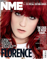
Q is a magazine about music which all college students are into massively; mostly every student will have a type of music they prefer listening to and Q magazine definitely covers all genres. I can use the music idea from Q for my own magazine as I know that's something all students are into. The layout of Q magazine isn't cluttered either, it's well organised and placed making the magazine look slick and organised which is another quality I could use for my own magazine.Cosmopolitan is a well known magazine. I think that the effect of the bright colours would immediately catch your attention. The audience is obviously mainly female but the contrasts of the colours would catch the eye of college students hopefully making it their first choice.
Planning:
Audience profile for my magazine.
- You wear hoodies, jeans, vans and chinos.
- You own an ipod and an iphone/blackberry/htc mobile phone.
- You have facebook/twitter.
- You're not very health concerned.
- You hate early mornings.
- You despise buses.
- You live for weekends.
- You are Hedonists.
- You are underachievers/radicals.
- Your parents are B/C1/C2 on the Jicnar Scale.
For college students who love music but don't want to spend their money on a magazine all about music, they want to read about fashion, food and fun things to do as well. They made read Heat but also read Q so this magazine will be packed full of pretty much everything.
If you are the kind of person who rents Mean Girls as well as Inception and the kind of person who listens to one song from Paramore and then the next from Lady Gaga. Do you drink endless mugs of tea and spend most of your time on the computer? Then this magazine is for you.
In my research I found that most of the magazines aimed at students weren't serious, they were more fun. They were interesting to the audience it was aimed at and the colour schemes were bright and the fonts were bold, clear and easy to read. I will have to corporate this into my own magazine.
Name of my magazine: Bloom
Cover lines that may be used:
- 'Your top 10 songs of 2011'
- '20% off Nando's voucher'
- '5 amazing ways to revise'
- 'Check out which crazy jobs you could be doing with your a-levels'
- 'Is driving too expensive? Survey inside'
- 'This years top festivals: Glastonbury, Reading, Leeds, Big Chill, AND MORE...'
Me and my partner Jess discussed possible names for my magazine. We used the online thesaurus to come up with some names for our final products. I typed in youth and the thesaurus suggested adolescence, childhood, greenness, ignorance, bloom, immaturity and inexperience and out of all of them 'bloom' really stuck in my head and I thought it would a really good name for my magazine. Me and Jess then discussed the other options but they don't really make good stand out names that would draw in our attention. So 'Bloom' became my final choice.
Next I looked at different fonts that could be used for my masthead with the title 'Bloom'
Arial Rounded MT Bold for the masthead.
Verdana, Lucida Handwriting, Eras Bold ITC and Georgia Italics were all used as fonts on my front cover and inside my contents page. I think these promote high standard and a classy look like an up market magazine would have and they're not too childish for my audience which is 16-18 years of age.
The photography I used was simple and me and my partner Jess worked on the contents page together and decided we would use our own photos on the front page aswell as inside. We considered using props such as books, headphone or an L plate for driving lessons but in the end we decided to keep things simple only using a mid-length photo of each other for our front covers which we created having blurred out trees behind the image which we created using the portrait setting on an SLR camera and it made the cover look fresh. For the contents page Jess and I decided to use some props we could find around college - for example we used to vending machines that we used as the picture to promote one of our inside stories about the vending machines eating peoples money and not giving them the right amount of change. We also used a car to go along side another inside story about passing driving tests; we could have used an L plate for that but we'd seen photos of real students who had passed their driving tests getting a photo with their certificate outside of a car - I think this created something that looked really real.
Subscribe to:
Posts (Atom)