NME (national music express)


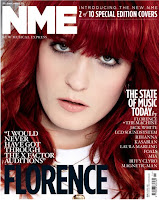
I've chosen NME as one of my magazines to analysis. It's described as 'indie' but personally I think most of the covers display mainstream music artists that are very well known, therefore i'm linking this with my second magazine, the old, original, classic Smash Hits.
The cover is easy to read, it's not cluttered, it's simply and slick. You can tell the front cover is glossy and chique and the colours are all flattering shades.
The cover is easy to read, it's not cluttered, it's simply and slick. You can tell the front cover is glossy and chique and the colours are all flattering shades.
![Kylie Minogue - Smash Hits Magazine [United Kingdom] (3 May 1998)](https://lh3.googleusercontent.com/blogger_img_proxy/AEn0k_sPbiQdtOGoQ4Mu6eVgU4Mau-FqPUvhEIdP2URhhVbQ1_RER9or5UBpCFQo9r4q1Q8wM3cRZWBtdBxgHYbDvW-WHQYRjcCC614d9AaPk-QOmbJ0CwAtX2TrKWCamwbWsDM=s0-d)


Smash Hits has been around since the 80's and became the major pop magazine for all teenagers as it printed the lyrics to songs, exclusive interviews and photos with artists and as there was no such thing as the internet then, there was no other way they could get their hands on content like that.
The old style of the covers obviously makes them vintage and the colours all work well together and compliment each other, making the bold title stand out. The title is also in a serif font suggesting that it's high quality. All the side titles are in sans serif which makes the titles jump out even more.
The connotation of this magazine is to entertain and inform.
The denotation would consist of the big bold name 'smash hits' being in a dominant colour such as red and it being on top of a fairly normal photograph that hasn't been tampered with too much. It informs the reader as they produce information such as song lyrics which are advertised on the front cover.
This was the first ever Smash Hits front cover, first appearing in 1978 but hitting the phenomenon in the 1980's. On the front cover is Blondie who was a massive pop sensation.
I like the front cover to this as it seems simple yet exciting and inviting. The colour of red used really stands out and catches the audiences attention. I like how then it was mainstream but now you could describe their style as 'indie' and 'vintage'.


Here are both of my magazines using Oasis as there front cover even though NME was published in 2010 and Smash Hits in 1995, NME is using old pictures on their front cover, close enough to the time around 1995 where Smash Hits used a 'recent' photo. You can see here the link between the two magazines and the aim I'm trying to achieve which is combining these two magazines to create a whole new one.
Content Pages:


These content pages from various magazines really caught my eye. They're all subtle colours but with one strong and bold colour which dominates the page.
These different styles will help me decide how to layout my own content page.
The fonts they use are all very different, sans serif and serif are used in all of them which determines the style of the magazine. Usually up class, sleeker magazines use serif which is the font I will use for my main titles.
SERIF FONT
SANS SERIF FONT
The pictures that these sample magazines are quite old fashioned, especially in two of the samples but this can be a good advantage as it makes the magazine look more chic and vintage which is something I intend to aim for in my own magazine.
Double Page Spreads:


The double page spreads all seem to run into one big picture and then an interview/article about the artist who is usually on the front cover.
I like the front cover to this as it seems simple yet exciting and inviting. The colour of red used really stands out and catches the audiences attention. I like how then it was mainstream but now you could describe their style as 'indie' and 'vintage'.
Here are both of my magazines using Oasis as there front cover even though NME was published in 2010 and Smash Hits in 1995, NME is using old pictures on their front cover, close enough to the time around 1995 where Smash Hits used a 'recent' photo. You can see here the link between the two magazines and the aim I'm trying to achieve which is combining these two magazines to create a whole new one.
Content Pages:

These content pages from various magazines really caught my eye. They're all subtle colours but with one strong and bold colour which dominates the page.
These different styles will help me decide how to layout my own content page.
The fonts they use are all very different, sans serif and serif are used in all of them which determines the style of the magazine. Usually up class, sleeker magazines use serif which is the font I will use for my main titles.
SERIF FONT
SANS SERIF FONT
The pictures that these sample magazines are quite old fashioned, especially in two of the samples but this can be a good advantage as it makes the magazine look more chic and vintage which is something I intend to aim for in my own magazine.
Double Page Spreads:
The double page spreads all seem to run into one big picture and then an interview/article about the artist who is usually on the front cover.
No comments:
Post a Comment